Aug 4, 2025
Design in 2025 is louder, bolder, and more expressive than ever, and the best part?
You don’t need to be an expert to start designing this way.
From scroll-stopping Instagram posts to eye-catching posters, bold fonts and bright color palettes are taking over the design world. At Grid Design School, we're all about helping beginners learn what’s trending, and how to practice it with ease.
So, What’s the Trend?
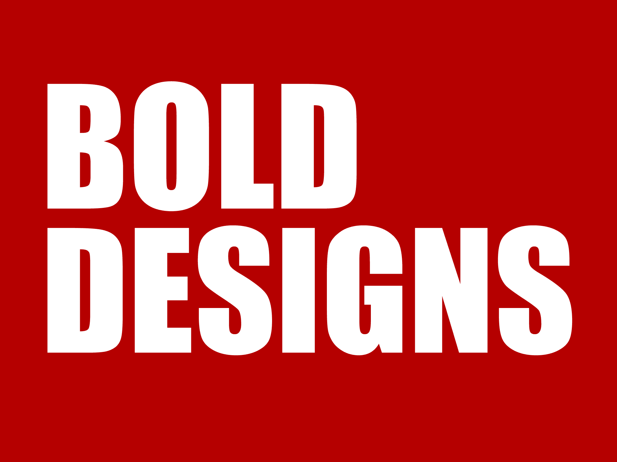
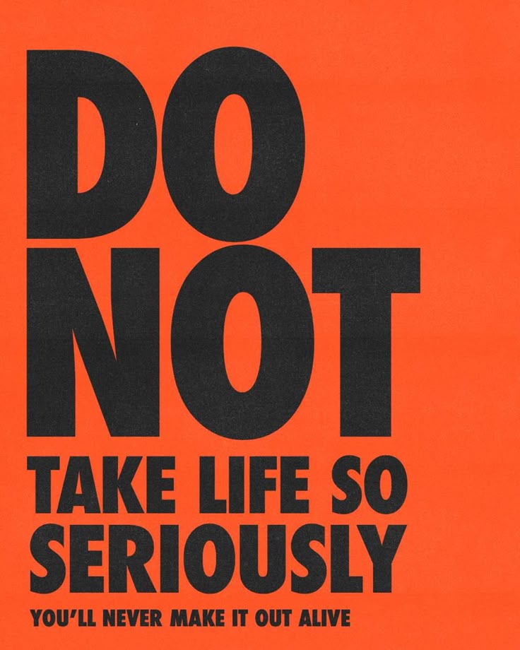
The design trend we’re talking about is often referred to as Bold Graphic Design, and it’s one of the easiest styles for beginners to master.
Here’s what it usually looks like:
Big, clear typography that grabs attention
High-contrast colors (neon green, hot pink, orange, purple, black & white)
Simple layouts using shapes, stickers, or frames
Fun, expressive energy that breaks away from boring designs
Why It’s Perfect for Beginners
Unlike detailed illustrations or complex grid systems, bold graphic design is about clear ideas and confidence, not perfection.
You can use free tools like Canva or Figma and create amazing work by just focusing on:
Choosing 1–2 bold fonts (sf pro display, anton or go to fontshare to find free fonts)
Picking 1 bright background color
Keeping the layout simple and punchy
Test contrast to make sure it’s easy to read
It’s fast.
✅ It’s fun.
✅ It’s great for building your first portfolio or social media presence.
Real-World Examples You’ve Already Seen
You’ve probably already come across this trend in your daily scroll:
Zomato & Swiggy Ads → Big fonts + minimal layouts + orange/red tones
Duolingo Instagram Posts → Bright colors, bold shapes, and expressive type
Spotify Wrapped → Vivid gradients and massive text blocks
Or just simply go to Pinterest and type bold typography
These brands use bold design to stay memorable, and now you can too.
Try This 10-Minute Design Exercise
Want to practice the trend right now? Here’s a super quick beginner-friendly task:
Create a Bold Poster
Set your background color (try purple, red, or neon green)
Add one bold headline (use Bebas Neue, Anton, or League Spartan)
Add one simple graphic or shape
Done! Export and share with us for a free review at griddesignschool@gmail.com with your name
✅ Bonus Tip: Check Contrast for Accessibility
Make sure your text is readable for everyone.
Use this free contrast checker tool:
🔗 https://webaim.org/resources/contrastchecker/
Accessible design = better design.
Want to Learn More?
This is just the beginning.
Inside our Beginner Course at Grid Design School, you’ll explore:
Easy Canva/Figma exercises
Typography & color theory made simple
Real-world design challenges
Portfolio-building tasks
Step-by-step feedback and support
Whether you're a student, a freelancer, or just curious about design, we’ve got you covered.
👉 Next batch starts soon!
Visit griddesignschool.com to learn more.